The Blog Market

  • Home
  • About
  • Resources Directory
  • Advertise With The Blog Market
  • Contact Us

6 Mistakes We’ve Made with Past Blog Designs

November 4, 2015 by jennifer Leave a Comment

I’ve experimented with my blog design long before I had my current blog, and even it has gone through 3 or 4 designs. The funny thing is that my goal has for the most part always been the same with regard to content, so why has it taken me so long to arrive at that really suits what I write? In chatting with Jennifer, we both agreed that while we’re pretty happy with our design styles now, it hasn’t always been that way. We’ve made plenty of decisions that have ended in strange designs and lots of time spent fixing them! So we made a list of mistakes we’ve made in the past—from both a designer and a non-designer enthusiast’s perspective—that we hope will help streamline your own design process!

Blog Design Mistakes

Mistake #1: Going for pretty, not functional

I’ve purchased blog design templates in the past in attempts to “get serious” about blogging. The problem was that before I learned anything about customization or functionality, I’d just look at a listing for a template and pick what was prettiest. I didn’t think of how it would work against my brand… Actually I didn’t think of branding at all. I once purchased a design that required the header to have a tagline, when I didn’t even have one! Another time I didn’t properly read reviews, and ended up with terrible customer support.

Mistake #2: Following trends exclusively

We’re both guilty of going with trends in the past, not because we thought it would make our blogs more popular, but because there are so many cool things we want to try. Trends can help you find what you want in your own brand and help you hone in on your aesthetic, but if you’re not careful, you’ll end up switching things up too much as the trends fade and tastes change. This leads to inconsistency and makes your blog more forgettable. Anyone who isn’t following you super closely won’t remember who the person behind the blog is, if every time they visit it’s different.

Mistake #3: Not getting a second opinion

Getting opinions on your blog is a delicate balance. If you ask 15 people and they don’t understand your vision or goals with the website, opinions will be sporadic and too personal to help. On the other hand, if you don’t get an opinion at all, you’re never going to see what others see. When you work directly on a project, you have a radically different viewpoint than every single other person! Jenn’s suggestion is to actually ask a reader what they think of the design before you launch, or at least a close friend! They can tell you whether you’ve left out certain details—especially in regard to functionality—or went overboard in some aspect.

Mistake #4: Letting the design take spotlight over content

The whole purpose of a blog design is to complement content, not overshadow it. As much as we love pretty design, at the end of the day, there’s no point in having a well-designed site if there’s no content. Have you ever come across a beautiful blog, but scrolled down to see that their content doesn’t match up? Awkward. So many bloggers having great websites—it makes anyone just starting out feel like they need to start with that, and they get lost when it comes to content. Design is a really powerful tool when it comes to getting content seen and appreciated, so it’s important to think of how they work together.

Mistake #5: Not establishing a timeline or deadline

I’ve worked closely with designers for a while now, and haven’t seen anyone launch exactly when they say they will. That’s just how it goes whether it’s me trying to tweak an existing design and realizing I have to wait until I have hours to set aside, or working with a client that seems to change her mind daily. Things happen with any creative process, but you can keep track in progress and have an end goal. Not doing so can mean letting design indecision take over or putting a project on hold indefinitely! While the deadline can always be moved, it’s important to have it there!

Mistake #6: Not paying attention to mobile or tablet views

It’s pretty obvious that when Jenn’s designing for Earl Grey Creative now, she’s always making sure a website is responsive and optimized for mobile and tablet. If you’re like me and do most of your blogging from a laptop, the fact that most people actually view from their phones is easy to forget! But people love to catch up on reading while on the go, so it’s essential that your design works there too.

Hope this mega list helped out anyone in the design process! Let us know what mistakes you’ll never make again. 🙂
Leave a Comment

November Desktop Download

November 2, 2015 by jennifer Leave a Comment

Happy November!! This is my favorite month of all. It’s the time of year that consistently feels like fall (at least where I live). The colorful trees in Oregon are out of control right now and it’s finally chilly outside, which is a wonderful excuse for all the hot drinks. Also, my birthday is this month so of course I’m experiencing all these strong, confetti-covered memories.

As for TBM, Angela and I have a lot of exciting plans for November! We’re launching our redesign very soon and will continue sharing tutorials and resources here. In between writing for TBM and working on our own freelance projects, we will also keep focusing on our online shop which will launch in a couple months. Good things are coming. 🙂

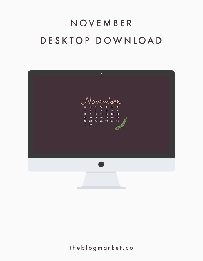
This month’s wallpaper is very simple. I love these colors together. Click the link below the graphic to download our November desktop!

November Desktop Download | The Blog Market
(click here to download)

How are you enjoying this month so far? I would love to hear what you all have planned for November!

Leave a Comment

Weekly Resources | Handmade Business Tips

October 30, 2015 by jennifer Leave a Comment

Have you been enjoying all the seasonal content around blog world lately? I seriously love this time of year because of all the parties and holidays, but I won’t even pretend I’ve had any parties to use up all the ideas I’ve seen… Yet. Maybe after Halloween! Since I’m not selling handmade items this year, I’ve certainly freed up a lot of time that I’d otherwise spend rushing through holiday season orders! At this point, I really want to help other people find the tools they need to end 2015 reaching all their handmade business goals! I think these resources will help.

Handmade Business Tips | The Blog Market

1. If you’re starting from the beginning, Elegance & Enchantment has a great guide to how to start an Etsy shop, and you will really have a leg up if you follow her steps in order! PS: If you get stuck on product descriptions, don’t forget about my tips.

2. Even though I can see tons of new sellers benefiting from these 6 tips learned from 6 years of selling on Etsy, I know of a ton of business that still struggle with these lessons! Check it out even if you think you’ve got it all down.

3. While sometimes these mega lists of quick tips can be full of things we’ve all already thought of, Kamila’s list of 75 ways to market your business is pretty essential. It covers even the littlest things you don’t think will help, but totally end up making a big difference!

4. Lastly, Christmas is coming and you might just want to print this checklist of 16 things to do to prepare your handmade business for the holidays. It’s not just about creating inventory and photographing it—to really make the most of this season (and make $$!) checking off as much as you can is super important.

Is anyone selling handmade this season? If any of you are selling in person in Los Angeles or Portland, let us know! And happy Halloween!

Leave a Comment

Using Textures + Patterns to Make Your Blog Stand Out

October 29, 2015 by jennifer Leave a Comment

As a web designer, I have had to focus a lot on finding a balance between clean minimalism and the “wow” factor that distinguishes one blog or web design from another. One thing I’ve been experimenting with all year is working with textures and patterns to add a little spark to websites. I love that so many color palettes look even more amazing when you throw in some gold foil, a marble texture, or a simple pattern. One of my most recent projects, a website for Luminary Retreats, is full of rose gold. We incorporated it into the logo, some text, buttons, etc. and I am obsessed! With all the rose gold we used, it still wasn’t overkill. The website ended up feeling calm and dreamy, reflecting the vision of the brand. Below are some of my favorite ways to use textures and patterns throughout blog design.

Using Textures & Patterns to Make Your Blog Stand Out | The Blog Market

1. Textured Icons and Buttons – Again, this is what I worked on with the ladies from Luminary. Rose gold was the perfect texture to go with the indigo and pale blue/gray shades of their brand’s color palette. You might also try marble or watercolor textures for icons and buttons throughout your site. Browse Creative Market and Etsy for hundreds of options!

2. Backgrounds – You’ve probably heard that white space is everything. I’m not here to object. I’m all about white space. But a wonderful way to add some contrast to your site is to add a subtle background pattern, either to the whole site container or just certain elements. Visit Going Home to Roost to see an illustrated background that enhances the design in a gorgeous way.

3. Blog Post Graphics – Being intentional about your blog post images and graphics is very important if you want your posts to draw people in from outside sources (Bloglovin’, Pinterest, etc). Marble and wood grain textures look great in blog posts (maybe you already have these textures in your home!). I also just love making my own quirky patterns for blog graphics sometimes like I did in this post.

4. Footer – The footer of your blog is one of the best places to add patterns and textures. Because it’s at the very bottom of your site, decorating it a little probably won’t clash with other elements of your blog. I really love how the team of A Beautiful Mess dresses up their footer with a simple hand drawn pattern.

5. Hover Effects -Looking for a way to add textures or patterns in the most subtle way possible? Meet your new best friend, the hover effect. The Everygirl is one of the prettiest, well-designed blogs on the web. When you hover over their menu links, you’ll see a simple striped background pattern that blends perfectly with the rest of their design. (click here to learn all about using hover effects with CSS)

Do you enjoy using textures and/or patterns throughout your blog design? I have some coding tutorials lined up on this topic, so stay tuned!

Leave a Comment

Our Favorite VSCO Cam Filters for Instagram

October 28, 2015 by jennifer Leave a Comment

I was thrilled with the response we got on our best hashtags for Instagram post over the summer, and I’ve been wanting to share some more Instagram secrets ever since. Given that I’m totally obsessed with VSCO Cam to edit my iPhone photos (I hear that Instagram has some pretty good filters nowadays but I’ve yet to try them as I love what VSCO offers so much), naturally it was time to share my favorite filters!

Best VSCO Cam Filters for Instagram | The Blog Market

What I love about VSCO Cam is that not only are there basically endless filter options—there are several free ones, including filter packs you can snag when they have promotions, and many photo packs you can purchase for next to nothing—but there’s an entire community of users out there to connect with over photography. It’s also incredibly easy to use. I’ve tried Afterlight and Camera+ for my Instagram photos, but nothing stuck except VSCO. Anyway, here are our favorite filters to use, and lots of examples for you to choose the ones based off your own aesthetic and brand.

Best VSCO Cam Filters for Instagram | The Blog Market

None – Sometimes on The Blog Market’s Instagram we don’t even use a filter, but with VSCO you can toy with the contrast, brightness, horizon line (always straighten those sunset photos, guys! It makes all the difference), and more without even choosing a filter.

A6 – It gives off a cooler, more contrasted tone, which is a vibe I’ve seen on a lot of more urban photography accounts like those with architecture and cityscapes.

B1 – This is your standard black and white filter, and while there are others, I think this gives off the medium of not looking too gray, but still remaining soft.

C1 – This is super vibrant but also feminine and though I don’t use it much, I love its effect on my floral photo! If you have a colorful account or a girly aesthetic, this one will make your tones pop.

F1 – F1 is my current go-to for my Instagram (check it out to see almost entirely F1 photos). It’s got this almost purple tone that I’m obsessed with because it completely goes with my blog and Pinterest aesthetic. It wasn’t one of the original filters which is why I was on the fence about VSCO for my own brand for awhile, but I fell in love again when I found this.

F2 – Here’s the filter I used to go with because I love that matte, film effect. I still love it but find that when you’re someone who posts generally vibrant photos, a bit of the drama can be lost. It’s all about the type of photos you take!

S2 – The whole S series is aptly named “clean” and I love it for The Blog Market. We seriously love colorful, pretty photos, and this one makes sure we don’t use it with over editing. At the same time, we’re not trying to be one of those crazy bright, rainbow accounts (though we sure love them) – we like to be a little more relaxed – so S2 maintains the vibrancy while toning down overly bright photos a bit. If you aren’t into super edited photos, definitely check out the S filters.

T1 – This is a moody filter with tones pared down and a bit of a darker vibe. I can see someone with photos of dark and dreamy interiors or who loves to photograph mood lighting really enhance their photos with this one. Again, if you love bright colors though, you might see that this one takes away the color pop you want.

Best VSCO Cam Filters for Instagram | The Blog Market

Keep in mind that with each of these filters, you can adjust the degree of their intensity! When I have a really naturally good image to start with, I don’t like things looking too over edited. So, I put my filter on and then tone the intensity down to about 6 or 7 in order to keep its original color without throwing off the aesthetic of my entire feed.

As tempting as it is to try each filter on every time you upload an image, if Instagram is something you’re focusing on growing or you want to maintain brand consistency, switching filters every time will throw off your game. I really love how all these different filters turned out on the images in this post, but when it comes down to it, I’m gonna stick to the S series for The Blog Market, F1 for my blog, and so on.

Hope this helped all who wanted to learn about VSCO and Instagram! If you get really into it, they have VSCO film for desktop photo editing. Have you guys tried the app?

Leave a Comment

  • Newer Posts
  • 1
  • …
  • 67
  • 68
  • 69
  • 70
  • 71
  • …
  • 99
  • Older Posts

Recent Posts

  • Easy Ways to Add Greenery to Your Workspace
  • How to use Pinterest board sections to get organized + stay inspired
  • Friday Favorites 05 | Terrazzo Trend
  • Best Creative Planners for 2020
  • 10 Journal Prompts for Creative Motivation

Recent Comments

    © 2018 The Blog Market · · BACK TO THE TOP